

From creative possibilities to Amazon’s guidelines and requirements, here’s what I learned about designing A+ Content for my book.
After my debut novel, Breaking Kylie, was published, I was introduced to something I’d never heard of before: Amazon A+ Content.
Since I’d just published a book and also happened to be a graphic designer, several Amazon KDP professionals suggested I look into adding A+ Content to my book listing.
So, I started digging.
I researched what it was, how it worked, what it could do for my book, and Amazon’s many guidelines and requirements.
And naturally, I decided to take a crack at creating it myself!
What I discovered? There’s a lot more involved than designing a few graphics and calling it a day.
Between choosing the right layouts, working with specific image dimensions, understanding what Amazon allows (and doesn’t!), and figuring out what information readers would find most useful, the whole process became quite the learning experience.
But I also realized how valuable A+ Content can be for authors who want to give potential readers a little more than the usual cover and book description.
And for readers? It’s worth knowing about, too!
So, I thought I’d share what I learned about the creative possibilities, design challenges, and Amazon’s guidelines, along with a few things authors and designers should know before getting started.
What Exactly Is Amazon A+ Content?
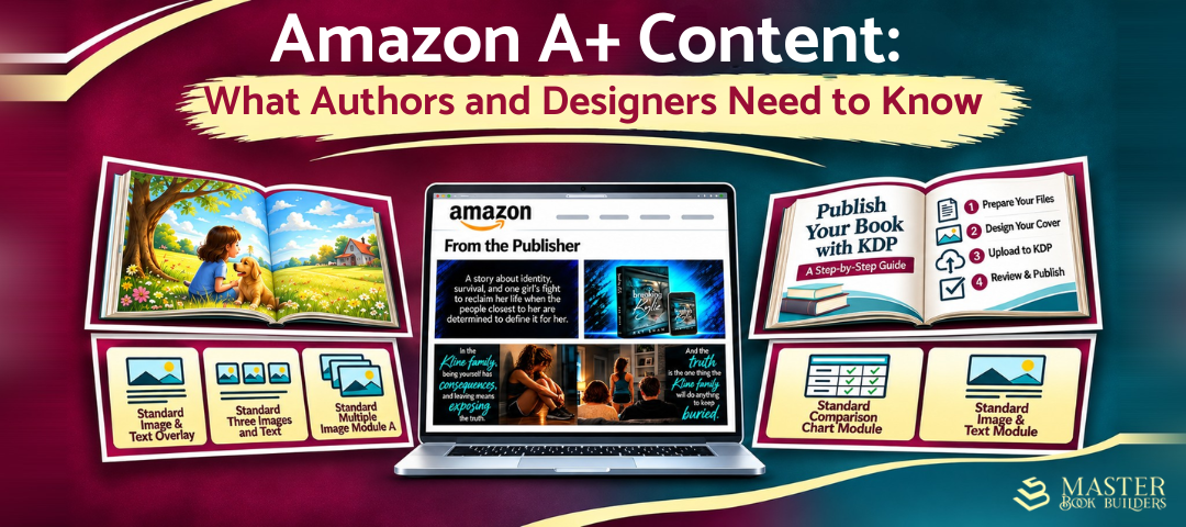
Amazon A+ Content is a feature available through Kindle Direct Publishing (KDP) that allows authors and publishers to add images, graphics, formatted text, and comparison charts to their Amazon book listings.
You may have already seen it without realizing what it was.

When browsing books on Amazon, scroll down and look for the “From the Publisher” section. That’s where you’ll find A+ Content.
Your cover catches someone’s attention, and your description tells them what the book is about. A+ Content gives you another opportunity to show them what makes it worth exploring.
Depending on the book, you can showcase interior pages, introduce themes, highlight special features, or provide details that might be difficult to communicate through a traditional description.
Why Should Authors Bother With A+ Content?
If you’ve published a book, you already know how much work goes into getting it out into the world.
Writing, editing, formatting, cover design, distribution, marketing… the list goes on.
So, the thought of creating even more content might not sound particularly appealing.
But depending on the type of book you’ve published, A+ Content offers some interesting possibilities.
Catch readers’ attention: Well-designed graphics can make a listing more visually interesting and encourage readers to explore beyond the description.
Showcase more of your book: Highlight illustrations, interior pages, characters, settings, themes, or features that might otherwise get overlooked.
Extend your book’s visual identity: Carry the colors, typography, and overall visual style of your cover into your A+ Content to create a consistent look across your book listing.
Help readers make informed decisions: Give potential readers a clearer idea of the book’s content, presentation, or intended audience.
Does adding A+ Content mean more people will buy your book? Not necessarily. But it does give you another opportunity to help readers understand what your book has to offer, and that alone makes it worth considering.
Amazon A+ Content Design: Creative Freedom? Sort Of.
As a graphic designer, this was one of the more interesting parts of the process.
At first, I figured I’d create some graphics, upload them, and arrange everything into a nice-looking presentation.
Sounds simple enough, right?
Well, not exactly.
Amazon uses predefined layouts called modules, so you can’t just upload whatever layout you want.
There are 17 standard modules to choose from, and you can use up to five in a single layout. Each has its own structure, text options, and image requirements.
For example, a wide banner module requires an image measuring at least 970 × 300 pixels, while a three-image module requires three square images measuring at least 300 × 300 pixels each.
And those are two completely different design challenges!
With a banner, you have room to spread things out, build a scene, or incorporate several elements. With a 300 × 300 square, however, you have to be much more selective. Try squeezing too much into that space, and suddenly nothing stands out.
But dimensions are only part of it.
You also need to consider visual hierarchy, or what draws someone’s attention first. Important images and headlines shouldn’t have to compete with too many decorative elements.
Text placement matters, too. You need to consider contrast, spacing, and whether the text remains readable when Amazon displays the graphics at a smaller size.
And here’s another consideration: Some modules include separate text fields, so you don’t necessarily need to put all your text directly into the graphics.
When I created the A+ Content for Breaking Kylie, I wanted the graphics to reflect the book’s visual identity. I incorporated colors and visual elements from the cover to maintain a consistent look, while adapting each design to fit Amazon’s different module sizes without overcrowding the layouts.
One thing became clear pretty quickly: Choose your modules before you start designing.
Seriously. Planning the layout first can save a lot of time and frustration.
What Should You Include in Amazon A+ Content?
Another thing I discovered is that different books call for different approaches.
What works for a children’s picture book might not work as well for a young adult novel or a nonfiction guide.
Fiction: Give Readers a Feel for the Story
For fiction, A+ Content can help convey the tone of a story and introduce readers to its characters, settings, or themes to help give readers a sense of what to expect.
With Breaking Kylie, I wanted to give readers a glimpse into the story’s themes without revealing important plot details. My goal was to spark curiosity, not explain everything before they’d even opened the book.
Sometimes an image or a carefully chosen phrase can communicate more effectively than another paragraph explaining the story.
Children’s Books: Let the Illustrations Do Some Talking
With children’s books, illustrations are often just as important as the words in telling the story. Why not give potential readers a chance to see some of that artwork?

I recently created Amazon A+ Content graphics for a children’s book, which gave me the opportunity to take a different approach to the design. Rather than focusing on a novel’s themes and tone, I worked with the book’s existing illustrations and interior pages to showcase its content and visual style.
Interior spreads, characters, and sample illustrations can help parents, teachers, and caregivers evaluate whether a book fits a child’s interests or reading needs.
Nonfiction and Guides: Show Readers What They’ll Get
For nonfiction books and instructional guides, A+ Content can take a more practical, information-focused approach.
Consider showcasing sample pages, diagrams, step-by-step instructions, interior layouts, or key learning features.
These examples help readers see how information is organized and presented, rather than relying entirely on a written explanation.
Regardless of genre, just because you have space for another graphic doesn’t mean you need to fill it.
Every image should serve a purpose.
Amazon A+ Content Guidelines: Lots of Rules!
Now, here’s where things get a little more complicated.
Amazon gives authors room to be creative, but it also has quite a few restrictions—and some might surprise you.
For starters, pricing information, discounts, promotional claims, and purchase instructions such as “buy now” aren’t permitted.
Even seemingly harmless words like “free” or “bonus” can cause problems. Amazon also restricts time-sensitive language, including references to new releases, holidays, and limited-time offers.
Customer reviews and star ratings aren’t allowed, either. Certain publication endorsements may be permitted, but they must meet Amazon’s specific requirements.
External website links, QR codes, and contact information are also restricted.
Amazon’s guidelines influence both the wording and visual elements you can include in your A+ Content.
For example, rather than creating a graphic advertising a special offer, you can use that space to showcase the book’s content, features, or other details that help readers better understand what it has to offer.
Then there are the technical requirements.
Amazon supports JPG and PNG images in RGB color mode, with specific requirements for file size, image quality, and readability.
And don’t forget alt text, which provides descriptions of images for people using screen readers. It’s an important part of making your content accessible and is also required by Amazon.
Small text, blurry images, spelling mistakes, or content that violates Amazon’s guidelines can result in rejection.
My advice? Read Amazon’s complete A+ Content Guidelines before you start designing, not after you’ve finished.
You’ll save yourself some headaches!
How Do You Submit Amazon A+ Content?
Once your graphics and copy are ready, it’s time to put everything together.
From your KDP account, navigate to the Marketing section, select your marketplace, and open A+ Content Manager.
You’ll name your project, select its language, choose your modules, and upload the corresponding images and text.
Next, you’ll apply the content to the appropriate book ASINs (Amazon Standard Identification Numbers), which identify individual product listings. You can associate multiple eligible formats of your book with a single A+ Content project.
Amazon KDP only allows you to apply A+ Content to book editions associated with your KDP account. If an edition was published exclusively through another platform, such as IngramSpark, you cannot add A+ Content to that listing through KDP.
For Breaking Kylie, my A+ Content appears on the Kindle and paperback editions, but not the hardcover, which was published exclusively through IngramSpark.
Before submitting, Amazon lets you preview how everything will look on desktop and mobile devices.
Take advantage of that!
Check your image placement, text readability, and overall layout. A design that looks great on a computer screen might not look as good on a mobile device.
When I submitted the A+ Content for Breaking Kylie, Amazon indicated that approval could take up to seven days. To my surprise, my content was approved within just a few minutes!
Amazon also noted that, once approved, the content could take up to 48 hours to appear on my book’s product page. In my case, it was visible within just a few hours.
Of course, approval and publishing times can vary, so not everyone will have the same experience.
If your book is available internationally, keep in mind that A+ Content doesn’t automatically appear across all Amazon marketplaces. You’ll need to check the settings and requirements for each one where you want your content displayed.
What I Learned: Pretty Graphics Aren’t Enough.

After researching Amazon’s guidelines and creating A+ Content myself, one thing became particularly clear.
I could have created five attractive graphics and called it a day. But if they didn’t tell readers anything meaningful about the book, what would be the point? My experience in graphic design and marketing communications has taught me the importance of purposeful design, and creating A+ Content was another reminder of that.
You need to consider how the information is organized, which elements should stand out, and how the text and visuals complement each other.
And sometimes, that means knowing what to leave out.
If someone has to squint to read your text or figure out where to focus their attention, the graphic probably isn’t doing its job.
And while A+ Content can enhance a book listing, it doesn’t replace a strong description, a professionally designed cover, or a thoughtful marketing strategy. Instead, it should complement those elements and give readers another way to explore what your book has to offer.
Why A+ Content Matters to Readers, Too
Amazon A+ Content isn’t just beneficial for authors and publishers. It also gives readers an opportunity to learn more about a book before deciding whether to purchase it.
So, the next time you’re browsing books on Amazon, scroll down and look for the “From the Publisher” section. You might discover additional details that aren’t included in the book’s description.
Want to see A+ Content in action? Check out what I created for Breaking Kylie on Amazon!


Leave a Reply