

The Cover of Your Book Speaks Volumes: Make Sure It Says What YOU Want It To Say
“Don’t judge a book by its cover,” she said.
He said it, too.
They all said it.
And, it was bad advice.
The world WILL judge your book by its cover. Your cover is the first impression people get. If your cover is not attractive enough or doesn’t fit the story your readers are expecting, they may turn away and not come back.
But I’ve got you covered.
“The cover of a book is the beginning of a conversation between the author and the reader.” ~ David Pearson, Irish Crime Fiction Writer
Consider this: we are a visual species. That’s why the web is so popular. It’s a visual tool. People log on to social to “see” something. I know there are millions who are not sighted, who operate from that handicap, and the tools they use give them their ‘visual’ clue with words. So, I am not generally speaking to them here – but I understand that alt-text on images and your book description on sales pages is so much more important to them – topics for another day, I think.
Today, I am talking about the rest of us.
I’m here to say a book cover – that visual representation of your book – can make or break you.
And, I know book cover designers agree with me. Especially cover designer, Julia Kuris, who offered this quote,
Book cover design is different from graphic design; it requires you to view the important piece of real estate on the front cover through a different lens than when designing a brochure or a business card. When designing a cover, you’re essentially designing a poster for the next Hollywood blockbuster movie, and your main aim is to be the circuit breaker in a world that’s fighting for our attention, to make the reader stop the scroll and notice you.
Let’s talk about what makes a good book cover.
A. Color. Generally, you need to stick to colors that help define your message. If you have a website (I say ‘if’ only because I’ve met folks lately who don’t have a website – we can talk about that another time), I expect that you have discussed color with your web designer. If your web designer is yourself, stop and have that discussion now. Colors mean something. Learn what they mean and apply that to both your web design and your book cover. Visit this link from the Interaction Design Foundation, where color and symbolism are discussed.
Color’s Compelling Mystery
Color is a powerful tool for evoking emotions, expressing thoughts and communicating with—and persuading—your users, but its symbolism is subjective and depends on the context.
B. Content. Your cover has your title. Your subtitle. Your name. At the moment, we’re talking front cover. It’s what draws people to the book, whether the book is on a shelf at a bookstore or displayed on a page in Amazon, your website, or elsewhere. The title has to be catchy. Not kitschy.
The title font needs to be visible from 10 feet away. The title font needs to be readable from 10 feet away.
The subtitle needs to define the title. Often, the subtitle is what convinces folks to approach the book, turn the book over, and then, if they like what they see, open it and browse.
Your name should be spelled correctly. I know of an instance where a traditional publisher released a book, thousands of copies were printed, and the author’s name was misspelled. Whose fault was it? You decide. The publisher did not recall the book to fix the error. And it didn’t hinder sales, but the author was unhappy, to put it mildly. I share that story a good bit because I want my authors to be bulldogs when it comes to their content. And I don’t want them to forget the content on their book cover.
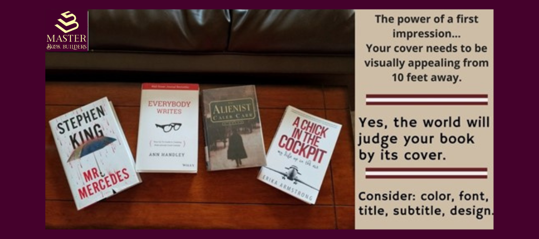
When I think of good book covers and good titles, I think of popular writers like Stephen King, Caleb Carr, Ann Handley, Brené Brown, and Erika Armstrong. Some of these authors’ books are pictured in the header. I included both fiction and nonfiction here because I am adamant that non-fiction writers can learn a lot about the development of their books from fiction authors. It’s what my new book, Bleeding On the Page: How to Bring the Magic of Fiction & Story To Your Nonfiction Book, is all about. Watch for it in the spring of 2025.
Now, look at the header and the book covers I shared. Digest their titles, fonts, colors, and overall cover designs. How do their covers make you feel?

C. The spine. Your book will have a spine, even if you don’t. Yes, that was an LOL. Your spine is of no interest to me. But, the spine of your book is another story. It’s an important element in cover design. The link above from Wise Ink goes into more detail on color and how it makes a spine stand out.
The books that attract the most attention feature contrasting colors, such as a light font on a darker background, or vice versa. This is useful when marketing your book because the spine will be visible at a distance and close up. You want the spine of your book to pop out at a distance, making the buyer want to walk up and grab it off the shelf!
Sometimes, in the heat of the writing, we focus only on our front cover. We want it to pop. We want it to grab a lot of attention. The spine needs to do the same thing in a much smaller space! The title, author, and publisher appear on the spine. Longer titles may hinder the design of the spine, and often, subtitles are not included on the spine.
The books we work on with our authors are not spineless. (Another LOL). In fact, the spine is of the utmost importance, and I want you to take this to heart – your spine represents your cover when your cover is not otherwise visible.
D. Back cover. This is part of your content. The back cover is as important as the spine but often gets little respect. It displays your book subject and blurb, and one or two testimonials. Once you understand that people in a bookstore or library who are drawn to your book will turn it over and read the back cover to determine if it’s something they might want to read immediately after they have (consciously or unconsciously) appreciated the front cover.
After that, they open the book and look through it. Read a few paragraphs. Decide to buy or not to buy. This is why Amazon has the “read sample” invitation.
At Master Book Builders, we discuss good back cover content well before the book is done. During our author meetings, after a few chapters are ‘finalized,’ Tom begins his journey with the author to determine cover design, spine, and back cover content. We do a much deeper dive into all of this with our author clients.

My claim to fame, for the uninitiated, is a book that generated a lot of attention in 2005. The title of the book was Dickless Marketing: Smart Marketing to Women Online. The content is woefully outdated now, but at the time, no one was talking about marketing to women, and I took that as a good indication my book would sell. I wanted small businesses to market more effectively to women, which they were not doing.
Back then, I don’t think Amazon even had bestseller status, so I didn’t market it for that purpose. Bestseller status does draw in eyeballs, just to be clear. That’s why Amazon includes it – Amazon wants your book to get noticed, but they don’t do marketing or promotions. The bestseller status is the closest you get to that. Yes, you can do ads, but that’s you doing the work, not Amazon. Amazon doesn’t sell books; it merely presents them, publishes them, and ships them to people who buy. I did know the content was useful and necessary. It helped launch my own publishing company, got me numerous speaking engagements, and proved that a book really is a calling card.
During the book’s development, I paid attention to everything I’m talking about here. Much of the praise goes to Tom, our designer. Though I had a POD publisher, we ended up taking the book in-house and doing the cover and page layout ourselves.
It was a worthwhile experience. It taught us a lot, and we bring that to everything we do with our authors today.
In conclusion, pay attention to your book cover. You may need to create three or four or more covers before you finally settle on the right one.
I’ll leave you with this thought and a call to action: if your book cover is as important as I say, who will you have on your team to make sure your book cover is outstanding? And, to get started, I recommend this visual training info presented by Canva, a tool many of us use to create our amazing graphic images online.
Connect with me on LinkedIn, where I share videos about writing, publishing, and marketing your book.


3 Comments
Leave your reply.