

Still No Justification (for justified page layout)
This is an update of a post I wrote way back in 2005, in our early book publishing blog, A‑ha! – Authors Helping Authors. While working with Yvonne on The How to Write a Book Book, I revisited the topic and found some new research.
Here’s an excerpt of my position in 2005:
DON’T.
Don’t use justified margins, I mean.
. . . Studies have shown that blocks of justified text are actually harder to read, because they result in odd spacing between words and excessive hyphenation by wordprocessing and page layout programs. The frequent wider spaces often line up from one line to another, producing distracting visual “rivers” of empty spaces winding down the page. It takes a lot of careful, manual adjustments of kerning and tracking to avoid these problems.
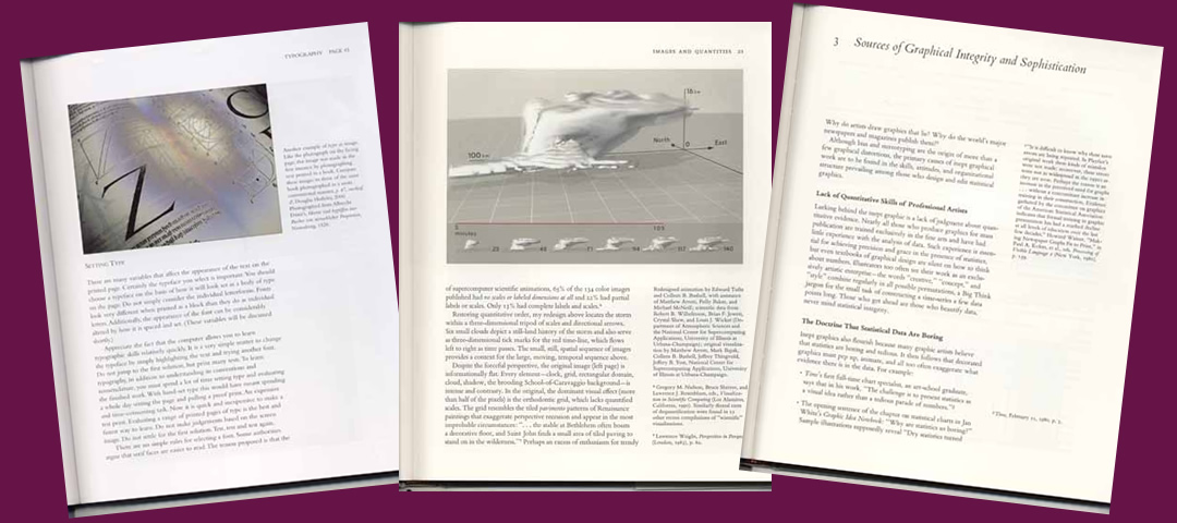
Take a look at some of the most beautiful, well-designed books produced in the last couple of decades [left to right examples in the featured image above]:
- Douglas Holleley’s wonderful resource for self-publishing, Digital Book Design and Publishing.
- Edward Tufte’s series of books on information design (especially The Visual Display of Quantitative Information, 2nd ed. and Visual Explanations):
All printed with left-justification, ragged-right.
All indie-published, as well, by the way.
In an article with roots in my past life as an appellate lawyer, Painting With Print, Prof. Ruth Ann Robbins urges lawyers to avoid justified text under the sub-heading:
“There isn’t much justification for justified text.”
Her article has been adopted and posted on the official website of the U.S. Court of Appeals in Chicago, available at http://www.ca7.uscourts.gov/Rules/Painting_with_Print.pdf.
Check it out. She offers lots of useful typographic advice and research to back it up.Not surprisingly, her article was printed in a scholarly journal … left justified, ragged-right. The editors found it necessary to add a note, assuring their readers that Robbins’ attack on tradition was her own fault, “rather than adhering to the page design and heading conventions of J.ALWD.”
So there are opinions on both sides. I’ll go with Robbins, and Tufte, and Holleley.
Updating the research
Because I feel so passionately about authors’ obligations to their readers, after rechecking the research, I devoted six pages in the “Book Book” to this topic in the chapter on page layout. I used subheadings like “Unjustifiable” and “Ragged Beauty.” Here’s a preview of one of the new findings.
From editor and “neuroscientist by academic training” Donald Samulack:
. . . any advantages that one may perceive to be achieved by using fully justified full-page lines, fall to the wayside when it is realized that by doing so you are challenging the basic neurophysiology of comprehension.
The author of Dynamics in Document Design also reported a NASA survey finding that 61.5% of readers simply prefer reading with ragged right over justified margins.
So, on further review, my original call is confirmed.
And from the Book Book, this reminder and my exhortation:
It’s your book. Don’t let a publisher, printer, or pundit talk you into a design that interferes with your readers’ experience.


4 Comments
Leave your reply.