

Page Layout: Designing for Marginalia
I’ve expressed my strong view that we should never allow right-justified margins, because they hamper readers in several ways. But I’ve neglected another important page design topic related to margins: providing ample space for marginalia — both the reader’s and the author’s.
Less Dogma, More of a Guideline
I’ll start by confessing that I’ve chickened out fully implementing the ideas I’m going to offer here, even in our own books. You can see in the scrolling previews on the “Our Books” page that The How to Write a Book Book has fairly standard looking margins. As in most books I read, you have to scribble in tiny characters on an angle or vertically to get notes of any length on the page.
In Read ‘Em & Reap, I dabbled with wider outside margins, writing in the Introduction:
“You may note the outside margins are a bit wider than usual. That’s to encourage you to take notes, right here in the book. Yes, I hear some gasping about writing in a book. But you’ll see why I favor that practice in my tips for expanding and improving your reading habits.”
But even then, the margins were only “a bit wider” and you can see in the preview they were inadequate to contain my callouts and other sidebar content. And I put the references at the end of the book, rather than in the margins next to the material they referenced. We’ll get to why that’s a poor design choice and how I knew better all along.
So like The Pirate Code dialogues in The Pirates of the Caribbean movies, I’ve treated the arguments for a generous margin as “more like guidelines than actual rules.”
In part, that’s because it’s unlikely they would serve any purpose in most fiction books. And in many of the nonfiction books we’ve worked on, I’ve reasoned that there was not enough reference material to make the extra blank white space on page after page seem purposeful.
What gives me pause and prompts me right now to review the important reasons in favor of designing for marginalia is twofold:
- I’m deep into co-authoring a new book with Michele Molitor, I Am Perfectly Flawsome: How Embracing Imperfection Makes Us Better, and we have lots of research and sources to reference.
- And we want you to have plenty of opportunity to make your own marginal notes.
Two Flavors of Marginalia
When I proposed this page design concept to Michele, she said a couple of things that pushed me to write this post. First, she warmed my heart by acknowledging that she, too, writes in her books! That’s the flavor of marginalia that I usually write about here.
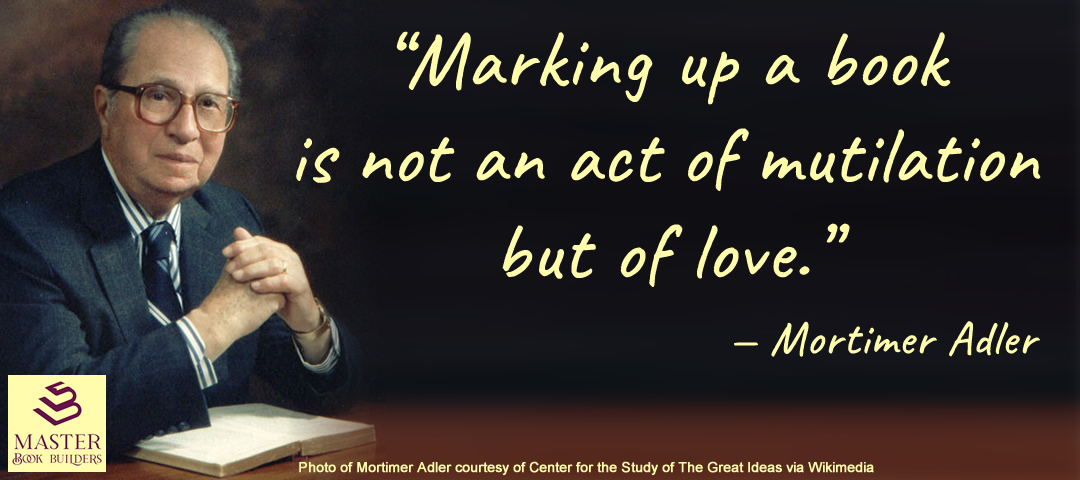
The quote from Mortimer Adler in the image above comes from his 1941 article, How to Mark a Book, where he calls writing in the margins “indispensible” to reading a book “intelligently and fruitfully.” I expanded on his suggestions in Read ‘Em & Reap, though to be fair, he didn’t have access to Post-It notes in his day. I called this practice “interacting with the text” and, on the specific benefits of writing notes directly in my books, next to the “passages and ideas I want to remember,” I explained:
“These notes might express my agreement, surprise, questioning of a point, or some connection to other work I’ve read. They will often form the seed of a future blog post, webinar, or talk.”
Perhaps even find their way into my next book!
Second, after hearing me wax on about the value of wide margins with printed “sidenotes” Michele asked why more books aren’t done that way. She wondered if there was some reason more publishers and authors avoided printing marginalia in their books and leaving space for readers to add their own.
I said it seemed to be little more that a long tradition and an attitude — similar to the printing of books with fully justified margins — of “that’s how we’ve always done it.” On checking some references, it turns out that “always” is a serious overstatement. According to Prof. Slight, in Managing Readers: Printed Marginalia in English Renaissance Books, the practice of including printed marginal notes in books that goes back to ancient times went out of favor in the early 1700s.
He notes that printing books with marginalia was more expensive in those days of setting type by hand. And the growing mass of readers with a taste for entertainment rather than information wanted cheaper books. He concluded with:
“Accessibility, not innovation, is the byword in the book trade. [So] the basic format of the printed page with its page numbers, running titles, and blank margins has changed very little over the past three hundred years.”
Conversations in the Margins
 He does, however, note that this “blank margin” trend was never universal and “some sorts of books continued to carry sidenotes.” Here’s an excerpt from a fine example provided by H.J. Jackson in her book, Marginalia: Readers Writing in Books. It’s from a 1775 edition of the famous book of English law with the lawyers’ shorthand titles Coke’s Commentaries or Coke on Littleton. The original text by Littleton is laid out in three columns (in Latin, French, and English). The left margin contains the printed “commentaries” by Coke. And the printer left a generous further margin, which contains handwritten notes, presumably commenting on the commentaries.
Slight pointed out that early exmples showed some authors included printed marginalia with comments directed at other writers and their works, prompting correspondence and even responding marginalia in updated editions of a work that had been critiqued.
Adler applies similar thinking to our handwritten marginal notes, calling them “a conversation between you and the author.”
The reasons for printed sidenotes haven’t changed since medieval monks were painstakingly adding them to books by hand. As Marshall Lee explained in Bookmaking: Editing, Design, Production:
“If they’re to be useful at all, these notes must be read at the proper time and so should appear on the page where the reference occurs. It’s an imposition to ask readers to search for explanatory notes at the back of the book (and a felony to make them find notes at the end of each chapter). Many, if not most, readers don’t bother to read them under these conditions, so the notes are a waste of time and space for part of the audience and a source of irritation for the remainder …”
Footnotes at the bottom of the page are little better, forcing readers who care about them to look down the page from the line they’re reading, and on finishing the note, find their place again above.
And wide margins with sidenotes continue to be used in some of the most beautiful books to this day, inspired by the book design teachings of Edward Tufte and modeled by many others who don’t bother to explain or defend the practice, as the featured image of my justified margins post shows:

There’s even a movement among web developers trying to figure out how to incorporate Tufte-style sidenotes into blogs and other online publishing tools. As Stowe Boyd noted there, the reasons for his desire to mimic the printed sidenote on screen devices is the same:
“Sidenotes appear in the context of the material that the refer to, or expand on. Jumping back and forth to footnotes inches or pages away is annoying and inconvenient.”
That’s also the rationale for Amazon’s KDP platform feature enabling a “Print Replica” format for ebooks, which we use for most of our clients’ books. That’s particularly important for nonfiction books, which usually include callouts or graphics that are most effective when viewed alongside the text they illustrate.
Tufte calls this keeping the text and its illustrating notes or graphics “adjacent in space, not stacked in tme.” The design choice is all about serving the readers’ needs.
What Do YOU Think?
That’s my case in favor of designing for marginalia. Now, can you do us a favor?
Here are three pages that I built from the current draft manuscripts of our book, in the preliminary layout concept that I showed Michele and Yvonne this week. The page size is 7.5″ wide x 9.25″ tall, one of KDP’s standard sizes. You may be able to find a book this size on your bookshelves, or if you’re in a bookstore or library, take a look at Brene Brown’s recent book, Atlas of the Heart (the hardcover pages are very close to this size).
Please let us know your thoughts about the design and how you feel about marginalia (both flavors), our sidenotes, and the space left for your handwritten ones.


Note: these samples show the layout of reference notes (pages 1 and 3) and a quotation (page 2), but not any of the graphics that will be included in other places.
You can get an idea of how those might be handled from these two additional example images, in Douglas Holleley’s book, Digital Book Design and Publishing (left) and Tufte’s, Beautiful Evidence (right). Graphics that are legible within the margin will be displayed there, but others may need to extend into the main text and some may span the full witdth of the page.

Leave us a comment or drop us line by email, or over on LinkedIn. We’d love to know what you think.


2 Comments
Leave your reply.