

[Marginalia] Imperfection as the Strength of a Work
This is a re-thinking of an item I wrote several years ago. Since it appeared in our emailed newsletter back then, but not on the blog, it may be new to most of our current readers. So here’s how it started:
“For this morning’s nonfiction reading, I grabbed The 99% Invisible City: A Field Guide to the Hidden World of Everyday Design, by Roman Mars and Kurt Kohlstedt. I found my bookmark at an entry called “Broad Strokes: Hand-Painted Graphics” describing the mostly lost art of professional sign painters.”
I marked the closing sentences of that entry, because they spoke to me about the off-and-on work I was doing, researching and writing on the theme that finally became a book this year, Flawsomism. The 99% Invisible City authors wrote:
“These days, new hand-painted signs are found more and more frequently around fancy boutique stores, cozy coffee shops, hip food trucks, and high-end grocers. Their more organic lettering has a certain appeal based in nostalgia, but there may be something else contributing to their prevalence as well. The imperfections, brushstrokes, and individuating marks subconsciously cue the viewer that there was a real person behind the process and that this person cared to make something both functional and beautiful.”
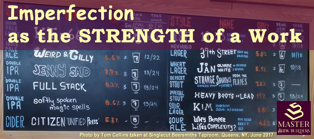
It probably tells you a lot about me that the references to “cozy coffee shops” and “hip food trucks” sent my mind to the signage common in craft brewery tap rooms! Rather than being painted, they are usually hand-lettered in colored chalk. I knew I had a photo on my phone from a past trip to the Singlecut tap room in Queens, NY, which became the featured image above and the focus of that prior writing.
Real, functional, and beautiful
I pulled those words from the quoted lines and will add a few more here:
- imperfections
- individuating marks
- real person
- cared
- functional
- beautiful
Of the hand-lettered beer list I wrote:
“The photo I dug out covers all the bases. You immediately get the sense that Gilly, Jenny, JÅN, and Kim had some role in naming those brews, perhaps even holding the chalk and lettering those entries on the tap list. ‘Indivituating’ them, in the term used by the 99% Invisible authors.
“For me at least, the artistic choices in the handmade fonts connected, i.e., performed their function well. I still remember the ‘flight’ that I selected that day (think, 4oz. glasses on a ‘liquid appetizer’ sampler tray, where you get to choose the menu items):
- JENNY SAID
- FULL STACK
- softly spoken magic spells
- STRANGE SHADOWS FROM THE FLAMES
- HEAVY BOOTS OF LEAD
“The layout of the sign functions well, too, providing instantly accessible information about the styles (e.g., IPA, Stout), whimsical, evocative names, alcohol-by-volume percentage, and serving sizes for on-site or take home options.
“Beauty, of course, is in the eye of the beholder. But, I mean, beer.
“And different colors of chalk to help separate the headings and columns. Plus, they expended the effort to draw the shapes of the different glasses they use to serve different brews. Yes, it matters to the “beer snobs” among us!
Lessons to apply in our work?
I offered just a few in the original newsletter item:
“Don’t fear putting yourself on display with hand lettering, or sketches.
“Don’t rely solely on digital design tools, or images from Pixabay and Wikimedia Commons (yes, I’m talking to myself as much as you on this one).
“Do snap images of your own notes and sketches (a la the marginalia I’ve been sharing) and find ways to incorporate them into your published work – even if you start with your social media postings to get yourself in the groove!”
To expand just a bit on those lessons, think for a moment about that phrase “individuating marks” from the 99% Invisible City authors. Isn’t that what you want for your business, your brand, yourself — to become recognizably individuated?
They point out that the most successful hand-painted sign makers developed skills “in specific styles and strokes of the trade.” And that’s what made them stand out and be successful: those “imperfections, brush strokes, and individuating marks.”
After all, those are the same things used to identify the fine art paintings of the masters, right?
The main lesson, then, is in the subtitle of our book, How Embracing Imperfection Makes Us Better. Identify the imperfections and individuating marks that make your work stand out and stop trying to eliminate them. Instead, turn them into part of your brand.


Leave a Reply