

Your Book Design is CRAP? That’s Great!
Okay, the acronym is, as its originator Robin Williams herself told us in The Non-Designer’s Design Book, Second Edition (2004), “memorable — but rather inappropriate.”
She actually presents the four basic design principles in the reverse order, which would give us PARC as the acronym. But of course that acronym was in those days dominated by Xerox’s Palo Alto Research Center and its twisted history as the source of design for both the Macintosh and Windows interfaces.
But back to book design, my point is that design principles should be understood and applied to your book, both inside and out. And violated only when you have a clear purpose for doing so.
Her four CRAP design principles are: Contrast, Repetition, Alignment, and Proximity. Let’s briefly review how they apply to book design.
Contrast
Contrast includes at least seven aspects, but all of them require one quality that Yvonne will tell you so often drives me nuts when it’s disregarded: contrast means that something is not just a little bit different, but very different. As Williams puts it:
“Contrast is often the most important visual attraction on a page — it’s what makes a reader look at the page [or cover] in the first place.”
Color Contrast –
 If you’re like me, when you think of contrast, the first thing that comes to mind is color. And that’s the one I think is most often abused. Here’s an example I found skimming the Graphic Design bestseller page on Amazon. Displayed here at roughly the thumbnail size it’s likely to appear when competing for attention on the web, the title is nearly unreadable.
I’m guessing the designer pulled the colors from the image that is supposed to convey something about shoemaking. But the color contrast between the background and text does not do the job. The colors are not “very different.”
When working with a cover designer, make sure they understand they’re not designing only for the print edition to be displayed on a table or shelf in a bookstore or library. I like to explain that nowadays a book cover design has to work at both 6 x 9 inches and 60 x 90 pixels.
Here’s an example, pushing color contrast toward the limit of black and white, using the cover of Child is Father to the Man, a book we’re working on with Ken and Alex Kolpan toward an early 2026 release:

This example also shows other aspects of Contrast that Williams highlights:
Size Contrast –
Here the size of the main title is much larger than the other text on the cover and the word Child is even slightly larger than the other emphasized words in the title. This is an example of consciously breaking that part of the contrast rule that says if you’re going to make something different, make it really different. Because the reason for emphasizing “Child” will only become clear when the reader gets inside the book, I chose to keep that more subtle on the cover.
The photo is a bit larger to draw the eye first to the cover from a distance, then down from the title to the subtitle.
Type Contrast –
Using type contrast effectively requires learning a bit about typography and its history. Williams does a good job helping designers choose among the vast number of typefaces, fonts, sizes, styles, weights, etc., that are available on our digital desktops in the section of her book “Designing with Type.”
She states as a “Major Rule”:
“Never put two typefaces from the same category on the same page. There’s no way you can get around their similarities. And besides, you have so many other choices — why make life difficult.”
The categories she’s talking about are Oldstyle, Modern, Slab Serif, Sans Serif, Script, and Decorative. Here are some examples of each category:

I also recommend a paper by Jon Bath, Tradition and Transparency: Why Book Design Still Matters in the Digital Age, for his exploration of the history of type design and how it relates to digital formatting. This quote speaks to why Amazon KDP recommends its “print replica” format for ebooks with substantial amounts of graphics and important design elements that do not display well in “reflowable” ebook formats:
“I think it is very telling that the digital format of choice for most electronic documents intended for continuous reading is the PDF — which is at its core simply a photo-facsimile of a printed document.”
Direction Contrast –
 Typically direction contrast refers to setting text on an angle, or curving around an image or object. Williams advises caution, suggesting you should force yourself to articulate in words why you want to use direction contrast to make specific text stand out. Here’s an example on another client’s cover, where I hope it’s apparent why we wanted the word “don’t” to stand out:
Note that in this case we used multiple contrast techniques, color, size, type style (bold italic), along with direction to make that word really different. Remember Williams’ repeated refrain about using contrast: “Don’t be a wimp!”
She also points out that direction can have another nuance with type when, for example, you might put a tall, narrow column of text in a sidebar, perhaps with a different background or a border.
Alignment Contrast –
Alignment is a separate item in the four design principles, but it has a narrower meaning when we’re talking about text layout. In a chapter on design and readability in her book, Writing at Work: Introduction to Professional Writing (free download), Meghan McGuire echoes my stance for using left aligned “ragged” right text, pointing out the both the APA and MLA style guides require it. Of course there may be times when you want to center or right align certain text, like headings or poetry (center), or a caption to an image that is on the right (right align).
It’s important to stay consistent with these text alignment choices throughout your book, which also falls under the “R” in our acronym, Repetition.
Graphic Contrast –
Adding graphics to a book supplies contrast almost automatically. But you still have to pay attention to all the other aspects. A table or chart might need a border to get the right level of contrast. An image with white along any of its sides might need a drop shadow, like the book cover just above.
And of course alignment, repetition, and so on must be kept in mind.
Negative or White Space Contrast –
In the book cover for Child is Father to the Man, above, we’ve left a lot of negative space (black in this instance) on the left and right to draw the eye to the center. I think this adds drama. Do you agree?
The principle applies to the interior layout, as well. We provide generous margins to accommodate both printing like the running header and/or footer content and, if the content inspires, some room for readers to write notes in the margins! Spacing on chapter title pages, around graphics or callouts, between subheadings, bullet lists, indented quotes, and many other elements all need to be thought out and implemented.
Line spacing, paragraph spacing, even character spacing to keep that ragged right alignment from being too ragged — the list of book elements that require thoughtful spacing decisions goes on and on.
Whew! Contrast is a big topic, eh?
Repetition
We’ve already talked about repetition in a couple of spots, but I want to emphasize that a useful way to think about repetition is consistency (though that would mess up our acronym). The point here is that repetition of design elements consistently throughout a book helps readers know where they are and what kind of information they’re looking at.
A well designed chapter title page, with that design carried through the book, is an obvious example. Running headers; graphics placed in similar locations with similar spacing; icons that indicate callouts; boxed chapter summaries; subheadings, bullet lists, indented quotations, that look the same; again, we could go on and on.
Alignment
Again, we touched on alignment as it relates to text, but here we’re expanding the concept to include how text aligns with graphics and graphics with each other. And how similar items align on the pages throughout the book.
I use Adobe InDesign for page layout work and it provides a range of tools for setting up margins, grids, guides, and the like for getting these elements aligned and keeping those alignments consistent across the chapters and sections of the book. Most design software these days will have some such tools.
Proximity
Finally, we come to the end of the acronym, which I hope no longer seems so inappropriate!
Proximity is about placing elements that need to be connected to convey their intended meaning “together” in some visually pleasing way.
Proximity goes hand in hand with the negative spacing aspect of contrast, but with a specific purpose: organization. When text and images, for example, are grouped in close proximity and those groupings are separated from others by negative space, organization emerges.
As Williams reminds us, like all of the above, proximity does not operate by itself. Its organizing effect is enhanced when we apply other aspects of CRAP toward the same purpose.
There are other design principles that operate alongside CRAP, but this post is getting kind of long. So I’ll touch on just one more here.
Transparency
In that Jon Bath paper I linked for you above, the title mentions “transparency” and the article goes into some detail about the concept as aspiring to create a book design that disappears so as not to interfere with the reader’s attention. Writers on design have gone so far as to call this a “crystal goblet” approach, likened to pouring wine into a glass that is designed “to reveal rather than hide the beautiful thing” inside (quoting Beatrice Warde).
But Bath warns us of the tension in that approach. More recent writings on reading (including my own), describe the relationship as writers and active readers co-creating meaning. As I think I’ve shown above, the same should apply to the design of the book, after the manuscript is completed.
Whether you’re designing your book yourself or working with a design team, applying these book design principles should be seen as another step in guiding the reader to a deeper understanding of your message.
Further Reading
Here’s a list of a few of the other books on design that have influenced my work over the years:
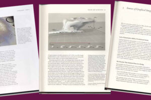
All of Edward Tufte’s books on information design
Bookmaking: Editing, Design, Production, by Marshall Lee
Digital Book Design and Publishing, by Douglas Holleley (available used)
Dynamics in Document Design, by Karen Schriver
Front Cover: Great Book Jacket and Cover Design, by Alan Powers (available used)
Information Design Desk Reference, by Christine Sevilla
Making the Invisible Visible, MTIV: Process, Inspiration, and Practice for the New Media Designer, by Hillman Curtis

Leave a Reply