

How Do Images Fit in Your Book?
“Words and pictures belong together.”
— Edward Tufte
Those words have inspired my work in book design since I first heard Tufte speak them at his full-day presentation in Boston nearly 25 years ago. As I recall it, he was holding a rare copy of Isaac Newton’s Principia Mathematica and discussing how the numerous diagrams and graphics helped readers understand the text.
In contrast, when the same quote appears in Tufte’s book, The Visual Display of Quantitative Information, he is discussing how text labels, notes, and “little messages” within charts, graphs, tables, and similar visual elements help viewers understand the quantitative information being displayed in data graphics.
The statement remains true from both perspectives.
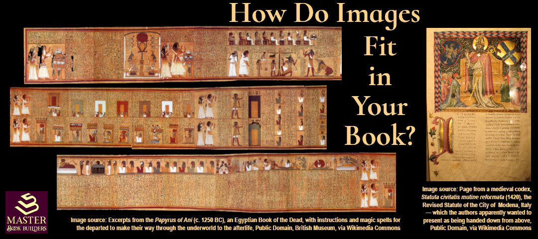
As the image above shows, since our earliest books we’ve used images and language together to get our points across and make our messages more appealing.
The questions for authors and their book designers become:
- what graphic elements will enhance their text for the reader
- what text, if any, may be needed within graphic elements to make them most useful to the reader
- how to prepare and insert those graphics into the book for both print and digital
What Graphics Should You Include, and What Should They “Say”?
When I speak of graphic elements in books, I’m covering a range of design possibilities. While we may usually think of graphics as most often appearing in nonfiction books to illustrate technical points, the growing popularity of graphic novels shows that’s too narrow a point of view. We’ll also cover some pointers for elements less often thought of as graphics that apply to fiction, as well as nonfiction.
Back around the time of that Tufte presentation, I’d recently left the practice of law. I’d been an appellate lawyer, meaning the bulk of my work had revolved around researching and writing briefs intended to persuade panels of judges to my clients’ points of view.
As the new millennium began, lawyers and the courts were adopting and adapting to desktop computers for both research and writing. I had been experimenting with embedding images in my briefs and my first effort to start a business of my own involved helping lawyers and firms incorporate the document design and knowledge management capabilities that the new office technology enabled.
In 2003, around the time I met Yvonne, the New York State Bar Journal published my article, “Beyond Words: New Tools Can Enhance Legal Writing” (link to reprint PDF), advocating for broader use of graphics in legal writing (content marketing, eh?). In that article, I used examples from history, as well as my own past legal briefs, to demonstrate how graphics can promote clarity, brevity, and convenience for writer and reader alike.
 My first example came from an auto accident case, where the description of the scene and how the accident occurred became much clearer and more succinct by including the police sketch from the record on appeal, shown here. Note how the officer labeled the sketch down to specifying the tracks made by each of the four tires, helping accident reconstruction experts determine the car’s speed and direction and whether it had stopped at the labeled stop sign.
I then discussed somewhat familiar examples from DaVinci’s codices with drawings of his inventions and the human body and Newton’s writings on math and physics, before turning to words from a more modern scientist, Stephen Hawking, who explained his decision to published a revised edition of his famous book, A Brief History of Time, under the new title, The Illustrated A Brief History of Time, this way:
“The aim in this new edition is to make it easier by including large numbers of illustrations. Even if you only look at the pictures and their captions, you should get some idea of what is going on.”
Hawking’s reference to “the pictures and their captions” reminds me of Tufte’s advice to include “little messages” within your graphics. Words and pictures.
 To further illustrate that point, I next described how inserting this simple graphic with labels enabled me to reduce more than 20 pages of medical expert testimony about the precision required for injecting a medicine into the epidural space without getting any into the subarachnoid space, where it would come into direct contact with the spinal cord, down to a half page of text.
In that article, I spent most of the space explaining how elements like photos, diagrams, maps, sketches, data plots, charts, tables, and other items we typically think of as “graphics” can improve how our writing communicates.
But I also noted that more common page layout devices like spacing, line and paragraph breaks, subheadings, callout boxes, and even italics and bold-faced type can help guide a reader’s attention and understanding of your words. As I wrote then:
“Writing itself is a visual medium. Most serious advice on writing includes some page layout guidelines … When you have something important to say in words, design principles can still help.”
This is where using graphical devices crosses over most commonly to enhance both fiction and nonfiction books.
 In the murder-mystery I’ve been working on recently, we made numerous design choices, for example, about where to start a new chapter and the design of the chapter headings and drop caps; or when the reader would be helped through a “jump cut” in the storylines within a chapter by adding line spaces and a visual signal — in this case a row of bold asterisks:

In a nonfiction book, we made liberal use of callouts, chapter-ending images, chapter-opening quotations, and subheadings, as shown here:

And we created a set of icons with special labels to call the reader’s attention to important points being made in the text, like these:

Now, whether you’re using graphics in the ordinary sense, or typographic design techniques, or hybrids like labeled icons to enhance your text, that question still remains, “What Should They Say?”
In my 2003 article, under the subheading “Practicing Graphical Excellence,” I discussed eight tips for getting the most out of using graphics in your text. Not all will apply, but the first one and at least one more should be relevant to any particular design choice you’re facing. If not, you may want to reconsider using a graphic in that context. I’ll list them here and let you go read the article (linked above) for the details:
- Know why you’re using a graphic
- Force visual comparison
- Show causality
- Capture complexity
- Keep graphics adjacent to the text being illustrated
- Minimize non-data ink
- Use small multiples
- Use color (only) with a purpose
That first one about knowing why should always revolve around helping your reader. The why is a combination of,
- why do they need help with this particular text? and,
- why is a graphic the best way to provide that help?
Put another way, will rewriting the text solve the problem, or will a graphic clarify it more effectively and efficiently? The rest of the list gets into choosing what kind of graphic will help the reader best.
If Yes, Then How?
So after you’ve applied these graphical excellence screenings and decided on a graphic, your task becomes creating the image files needed for both print and digital book formats, and then inserting them into the book so they display as you intend.
There are many options available for designing graphics and exporting them to a file format that can be printed. While I work mostly in the Adobe Creative suite (InDesign, Photoshop, Illustrator, and Acrobat), unless you have access to them and are comfortable with some complexity in using them, I’m going to suggest that you stick with simpler tools like Canva.
Again, you may hear different image file requirements, and if you’re working directly with a printer you’ll want to deliver in the format, color space, and resolution they request. But I’m going to assume you’re an indie publisher using Amazon KDP, IngramSpark, or a similar online publishing platform. For those, Canva and similar tools will generate a print-quality image file in the PNG format. What you need is a minimum resolution of 300 ppi (pixels per inch), if the tool allows you to set the resolution.
How you embed your image into your text will depend on what tool you are using to create your manuscript. For most publishing platforms, you will need to export the finished book to a print-ready PDF file. Again, I work in Abobe InDesign for laying out books and exporting to PDF. But I know there are instructions out there for using Microsoft Word to layout books, which enables you to “Save As” a PDF, so here’s how you’d embed your image in a Word document:
After placing your cursor in the text that your graphic will illustrate, in the top navigation click Insert > Pictures > from This Device and select your image from your files in the popup box. The image will appear as an inline object in the text.
To enable you to freely adjust its size and location in relation to the text, right-click on the image itself. A popup box will appear, and when you hover your cursor over the Wrap Text option, another list of options for how you want the text to wrap will appear. You’ll usually want either Square (shown below) or Top and Bottom (which makes the text skip over the image, for when you want the graphic to fill or be centered in the width of the page).
Once you’ve placed the image and wrapped the text around it, you can freely drag and drop it to where it looks best for enhancing the text and serving your reader.

When you export the document from Word to a PDF, the images will be fixed in the locations you’ve placed them and the book will be ready to upload to KDP or your preferred platform for printing.
Digital
Preparing your graphics for digital books presents a different set of concerns. Mainly, you will be trying to get the smallest file size that maintains an acceptable image quality. Canva has an export setting called “PNG Standard” for files intended for screen viewing, which produces smaller file sizes. If you’re working in a tool that allows you to set the resolution, you’ll want to use 72 or 96 ppi. You may also be allowed to choose a quality setting for JPG files, such as “high” or “very high,” which will improve the appearance, though it will also increase the file size.
In the end, you need to maintain an image quality that serves both your needs and those of your readers.
If you’re publishing via KDP, they recommend that image-heavy books be published in the “Print Replica” format, which keeps the images where you placed them, adjacent to the text they’re intended to illuminate. We use that format for most of our clients’ books for just that reason.
Bonus: KDP Enables Video and Popup Images in eBooks!
This one is new to me, so I’m sharing with the understanding that I haven’t actually published an ebook enhanced in these ways. I’ve read the KDP help articles and watched a couple of tutorials.
Here’s what I’ve learned. Using the Kindle Create tool and its Print Replica format, you can now embed audio, video, and image files that will appear in your ebook as clickable icons. When a reader clicks or taps the icon, the audio or video will popup in a player and the reader will be able to listen or watch right from within the ebook on their Kindle device. Similarly for images, the full-size image will appear in a popup right at the place in the text where you intended them to see it.
Note: to use these features, you’ll have to plan for the empty spaces where you want those icons to show, as shown in this quick video I recorded to show how the process of embedding looks in the free Kindle Create tool (note: there is no audio and the delays are me finding the video and image files to embed):
Over to You!
This post is already a bit long, but I know there are loads of details that I’ve had to gloss over or skip altogether. I hope I’ve at least shown you why it’s worth your time to learn how to use graphics in your writing.
Please leave a comment with any questions you have, and I’ll do my best to fill in the gaps.
Leave a Reply